HEALTHCARE AND SOCIAL CARE B2B2C E-LEARNING PLATFORM
Get Licensed
E- Learning & Certification
Year
2025
eCert is a leading B2B2C e-learning platform designed to support compliance training in the healthcare and social care sectors in the UK.
Impact & Insights

Background
In a strategic move, Get Licensed acquired a UK-based company offering training and development solutions for care home staff. The acquired product, eCert, focused on helping care homes ensure compliance with CQC (Care Quality Commission) standards by providing certifications for caregivers through a training portal.
As the Lead Product Designer, I was tasked with leading the product transformation — from branding to UX redesign, user research, and ultimately, a brand-new learning experience.
The Challenge
The acquisition came with outdated branding, a clunky user experience, and a business model dependent on non-scalable workflows. The training process involved downloading PDF courses, completing assessments manually, and managing everything via a non-responsive web portal. This created friction for both care managers and caregivers, many of whom lacked access to computers.

Key pain points included:
Outdated branding and user interface
Manual, PDF-based learning
Non-responsive portal requiring physical computer labs
Poor UX/navigation but high user familiarity (hard to change drastically)
Low engagement and low assessment pass rates


Branding Rescue Mission
Initially, we outsourced a rebranding project to an agency. However, during the review meeting, the stakeholders — across Product, Marketing, and Operations — felt the new branding lacked depth and relevance.
💡 I took charge with my team to refine and rebuild the branding using elements from the agency's work and our own vision. This new visual language became the cornerstone for all design efforts moving forward.
Understanding Our Users
We conducted qualitative research to understand both the care managers (admin users) and caregivers (learners). Scheduling interviews proved difficult, but we partnered with the Managing Director (former CEO of the acquired company) to personally connect us with engaged users.
Findings:
Caregivers were mostly migrants from India and Nigeria.
Most care homes lacked computers, so learning required after-hours access to a "computer lab."
The existing UX was bad, but users were accustomed to it.
Care managers needed certification tracking for CQC audits.
Learners wanted mobile-first experiences and easier assessments.
Web Portal & Website Redesign
We began redesigning the web portal and public website using the new branding guidelines.

Key Activities:
Ran workshops with stakeholders to define the homepage hero section and landing page strategy.
Collaborated with Marketing on website content, visuals, and copy for conversion.
Redesigned the full user flow for care managers and caregivers with better UX and accessibility.
Introduced a responsive design so users could access learning materials from any device.


Pricing Model Redesign
A cross-functional team was formed to define a new credit-based pricing model catering to both businesses and individuals.
I supported:
A/B testing designs for the pricing page
Collaborating with frontend developers to implement changes in real time
Using learnings to finalise a competitive and scalable pricing strategy
PDF Redesign & Learning Engagement
Our visual design team took on the challenge of redesigning all 45 course PDFs to:


Improve layout and readability
Add illustrations and guidance tips
Motivate learners to engage with the content
This led to a notable increase in reading time and assessment pass rates.
New Portal Launch & User Support
After internal testing and stakeholder approvals, we launched the new portal and website.
⚠️ Initial Pushback: We faced a surge of calls and complaints — users felt lost in the new interface.
Actions Taken:
Conducted quantitative analysis via FullStory
Identified user friction points
Created video tutorials, email guides, and YouTube walkthroughs
Integrated onboarding tutorials into the portal itself


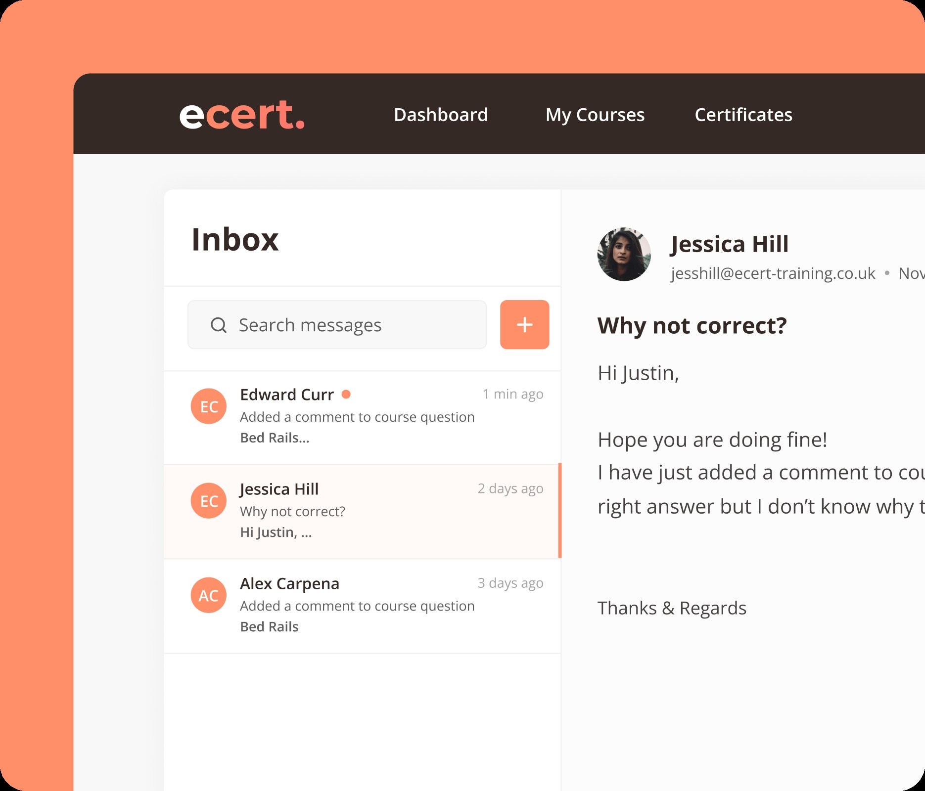
📈 Result: Drastic reduction in support calls and improved user satisfaction.
Designing the Mobile App
Our research clearly showed a strong need for a mobile-first learning experience.
We ideated a byte-sized, video-based learning app tailored for caregivers.
Key Design Decisions:
Short, vertical-format videos (inspired by TikTok and YouTube Shorts)
Assessments integrated into video modules
Swappable assessments (e.g. swipe for True/False, tap image-based answers)
Bold subtitles, multilingual support, and accessible UI

We collaborated with a video production team to convert PDFs into scripts and then engaging short-form videos.
After rounds of internal testing and QA, the app was approved and prepared for App Store and Play Store launch.


Outcomes
Website & Portal:
Improved user engagement
Increased course completion and pass rates
Easier navigation with minimal learning curve
Positive feedback from CQC-audited care homes
Mobile App:
Bite-sized, on-the-go learning for caregivers
Higher engagement thanks to visual, interactive assessments
Seamless integration with the portal for care managers to track progress
Key Learnings
User familiarity can be a double-edged sword — redesigns must be gradual and empathetic.
Video content and responsive design are critical for non-desk workers.
Direct collaboration with sales and operations unlocks deeper user access.
A collaborative cross-functional approach creates lasting product impact.
Next Steps
We're now focused on:
Scaling content localisation (especially for migrant workers) and introducing landing pages for these funnels.
B2B campaigns for care homes by designing their web pages in order to get traction.
Monitoring CQC reports to analyse and refine the needs of care homes in order to present their profile on the web.

More Projects


Figma
Figma
Trello
Claude
ChatGPT
Blender
Framer
Webflow
Rive
Trello
Trello